Sophy Rickett’s Objects in the Field
Objects in the field came about during Sophie Rickett’s encounter with Dr Roderick Willstrop at the University of Cambridge, IoA. Dr. Willstrop in the 1980s designed the 3 Mirror Telescope which was operational for about 12 years before it was taken out of use in 1997. It was used to photograph distant stars and planets. Willstrop’s historic use of photography was to support his scientific studies whereas in contrast, Rickett’s use was for artistic values. This became the story that ran alongside the work of Ricketts as she faced the conflict of producing a body of work for artistic reasons, whilst Willstrop maintained they now had no scientific value.
The telescope was operational in producing black and white negatives until 1991 where it was modified to produce digital images. Rickett’s was assigned to develop the negatives into full frame prints, which had Neve been done before, this was twelve years after Dr Willstrop had retired. The project largely centres on Rickett trying to align her work with the scientific standpoint of Willstrop. Rickett describes how she clashes with Willstrop over artistic content, with a very definite tension between the two as they resisted each other over the material.
Rickett’s work reflects a postmodernist approach as her project follows no linear storyline, with no clear beginning, middle or end whilst also using a mixture of artistic styles and mediums. The set of images was accompanied with a 2000 word essay in the form of a booklet and monitor based video. Whilst Rickett initially set out to develop a set of scientific negatives, the resulting project seems to centre on the artistic and scientific discourse between Rickett and Willstrop. It seems this apparent struggle was neither expected or anticipated and therefore a purely organic process took the project into an entirely different realm. To my mind this is perhaps why the images are in need of the relay information as perhaps without it these images would not portray their true meaning to the viewer. It seems to me that when a story is being relayed in this fashion, subsequent information must be in the relay manner as it is as important as the images themselves. What Rickett is saying is that her work is not just the images, they are a product of something else which is what provided the catalyst to the end result. Without the accompanying relay information the images would perhaps be rendered pointless.
Below are two images for artistic reference only.

Whilst I love the idea and story behind the work, I personally don’t find the images particularly evocative in any sense. They are aesthetically pleasing but don’t move me in the way that the work of Sally Mann or Francesca Woodman does. This takes nothing away from the vision of the series or the artistic content, maybe it is just me beginning to understand what I connect with photographically and what I don’t.
Sophie Calle’s Take Care of Yourself
Below is Sophie Calle’s introduction to her work from 2007 entitled “Take care of Yourself”. The work surrounds Calle’s relationship being ended by email, and her subsequent quest to analyse and digest the meaning of what was said in the email. She enlist the help of 107 professional people to help her interpret the text whilst using their professional skills.
“I received an email telling me it was over.
I didn’t know how to respond.
It was almost as if it hadn’t been meant for me.
It ended with the words, “Take care of yourself.”
And so I did.
I asked 107 women (including two made from wood and one with feathers),
chosen for their profession or skills, to interpret this letter.
To analyse it, comment on it, dance it, sing it.
Dissect it. Exhaust it. Understand it for me.
Answer for me.
It was a way of taking the time to break up.
A way of taking care of myself.“
The resulting book and exhibition documents all of the 107 ways the text was transcribed by the various professionals, sometimes this maybe from a legalistic approach or the letter is reinterpreted by music or dance. Alongside the meanderings are portrait photographs of the women who digest the letter and try to help Calle understand what indeed it means of feels like to me dumped by email. Why 107 women were asked to digest the email is unclear, but what does follow is an interesting body of work that reflects the post-modern approach to narrative. Sophie Calle sets out to tell a story, but this is by no means linear, there is no end result other than the final “take care of yourself”. Could this story be told with just a set of images is perhaps not even justified as it probably couldn’t exist. But it could result in a very different way than what Calle achieves by her post modernist approach. The dialogue between the viewer and the artist is messy, uncompromising and open for debate, much like the essence of the story itself. There is no beginning to these feelings or knowledge that is shared, only a response that is not held by time, it doesn’t matter when it occurred. The resulting work is a response to a relationship breaking down and for that matter by the digital form of email. The manner of this harsh end make for responses that are tied together by artistic licence and have no structure much like that of a failed relationship. But that is perhaps what makes the work so cohesive, the frailties of open debate are cast upon the viewer in a way that somehow manages to make it easier on the eye. The willing participants accompanying information is as important as the images, if not more so, but the straightforward portrait style imagery can only be described as powerful as the various forms of media used to rely them.
Below image for artistic reference only.
References
(ONLINE) https://sophyrickett.com/work#/objects-in-the-field-1/ (last accessed 09.05.20)
(ONLINE) https://www.artbook.com/9782742768936.html (last accessed 08.05.20)
(ONLINE) https://blogs.mhs.ox.ac.uk/insidemhs/sophy-rickett-objects-field/ (last accessed 09.05.20)
(ONLINE) https://www.tate.org.uk/art/artists/sophie-calle-2692/sophie-calle-dumped-email (last accessed 09.05.20)
Kaylyn Deveney – The Day-to-Day Life of Alfred Hastings
I followed on some of this research with looking at the work of Kaylyn Deveney, and her project in collaboration with Albert Hastings. The series struck me initially as I have great empathy with the photography of everyday things, something I partially looked into in assignment 1. It is a truly remarkable set of images that are in equal parts owed to the image and the informative text that accompanies them. I believe that the images would not herald the same emotive connection with the viewer if it was for the simplistic descriptions of what is going on in the pictures. From as aesthetic point of view I also love the cropping, framing and in particular the lighting that Deveney uses in the images. It creates an aged warm glow that would be symptomatic of an elderly persons home, and brings to life elegant cups and saucers, teapots and uninteresting old fashioned lampshades. Clever use of perspective also add to the narrative style, with minimalist views and shots of hands and heads dominating the frames. A very special body of work, and again really highlights the power of accompanying relay information alongside imagery. I love this minimalist approach, its something that resonates with me perhaps more than the use of audio or video to convey meaning to the viewer.
Below are two images for artistic reference only.
I love the warm backlight of this image, coupled with the hurried expression of Albert and a smidgeon of camera blur adds to the feeling of movement. Tight cropping add to the snapshot feel of the image.
A brilliantly composed image here places Albert in middle of his drying pyjamas. Deveney places him just to the left of the frame as he stands in front of a window, busy with daily chores. The viewer is also treated to a small amount of natural light creeping through the open curtains to the bottom right of the frame.
Reference
(ONLINE) https://kaylynndeveney.com (last accessed 09/05/20)
(ONLINE) https://kaylynndeveney.com/the-day-to-day-life-of-albert-hastings (last accessed 09/05/10)
Karen Knorr – Gentlemen
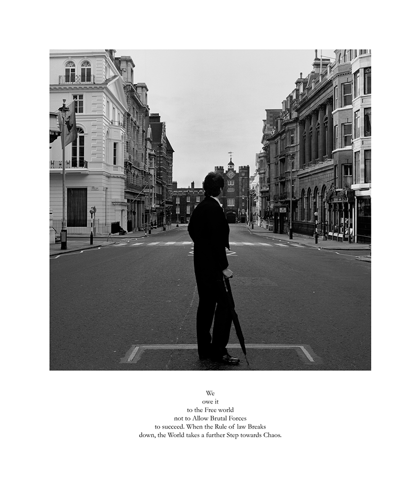
I also looked into the work of Karen Knorr and her set “Gentlemen” which consists of images taken in English gentlemen’s clubs in central London between 1981 and 1983. Again a set of work that is accompanied by text but this time not so much in a meandering fashion but perhaps more deliberate text gathered from parliament speeches and associated news. The two subjects seem to marry very well together and certainly add to the black and white imagery that Knorr uses. It paints quite a provocative picture of that era when gentlemen clubs were just that, and even the most powerful of woman were not allowed membership. It is interesting to see that most of the images have a wide depth of field, to capture the detail and magnitude of these illustrious clubs inside and out. Again clever framing dominant the images with beautiful use of open doors, staircases or mirror reflections adding to the feeling of nostalgia and intrigue. Often the associated gentlemen appear in the frame, but usually alone or only few, adding to the sense of entitlement and elitism. An interesting body of work, but one that does not resonate with me in the way that Deveney does, partly due to the subject but also the fashion in which delivers her information. I am much more drawn to the mystery of the ordinary and the sublime way it can be captured and portrayed. I also enjoy the mentality if handwritten notes alongside the image, perhaps not perfect but fits so well with the message in the image. To me its organic, natural and honest not to dwell to much on this relay information, a dribbled sentence, a quick thought, a hasty response. To me personally, that is the most real and uncomplicated but also so easy to miss or misunderstand.
Below are two images for artistic reference only.
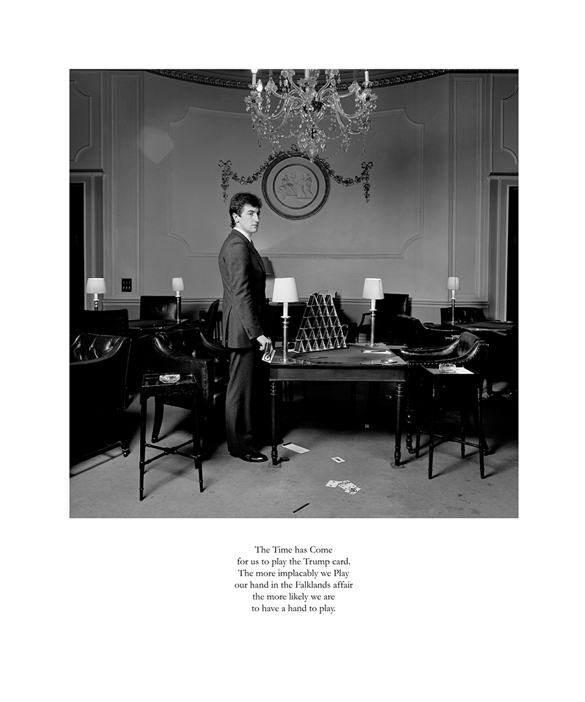
It is interesting to see the combination of the accompanying text with the image which Knorr uses in the series. These seem to highlight power and the privilege associated with the more fortunate minority, yet Knorr seems to be subtley mocking this with her quite, thought provoking imagery.
Beautiful composition here draws the eye to follow that of the subject to the bottom of the frame. The image is punctured with a message of true British stiff upper lip mentality.
References
(ONLINE) https://karenknorr.com/photography/gentlemen/ (last accessed 09/05/20)
(ONLINE) https://www.theguardian.com/artanddesign/2016/oct/31/gentlemen-karen-knorr-london-clubs-mocking-rich-powerful (last accessed 09/05/20)
