Execution
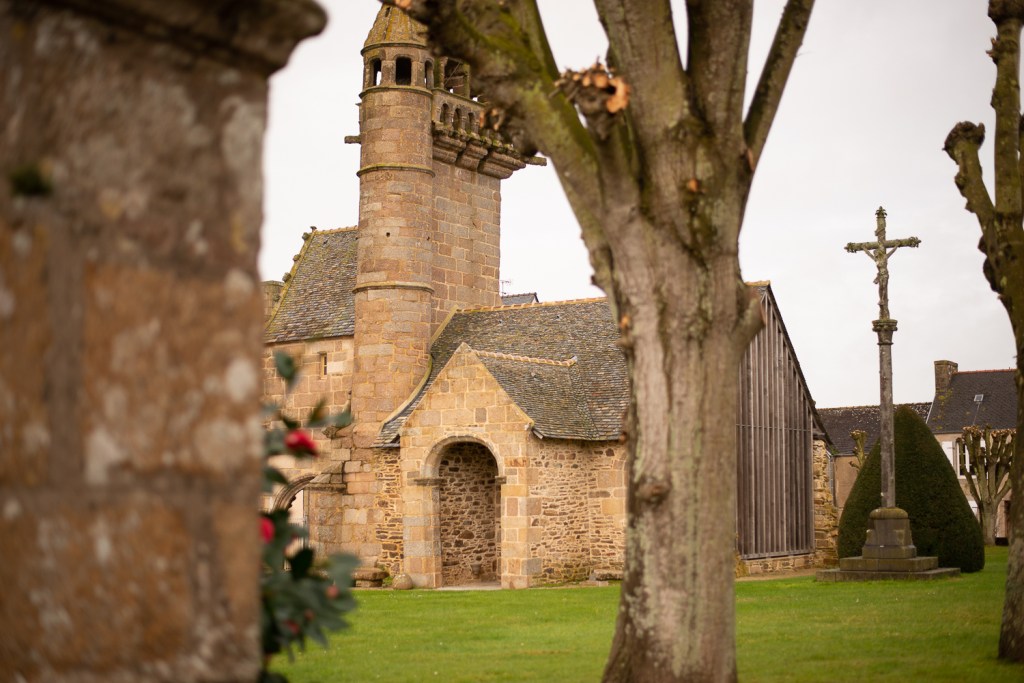
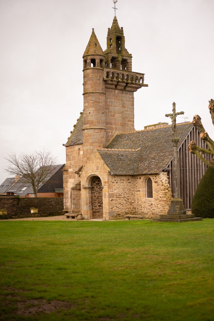
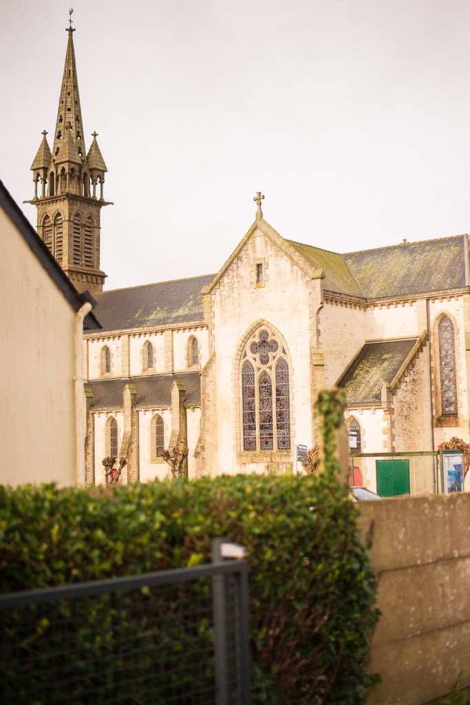
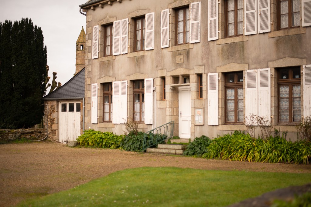
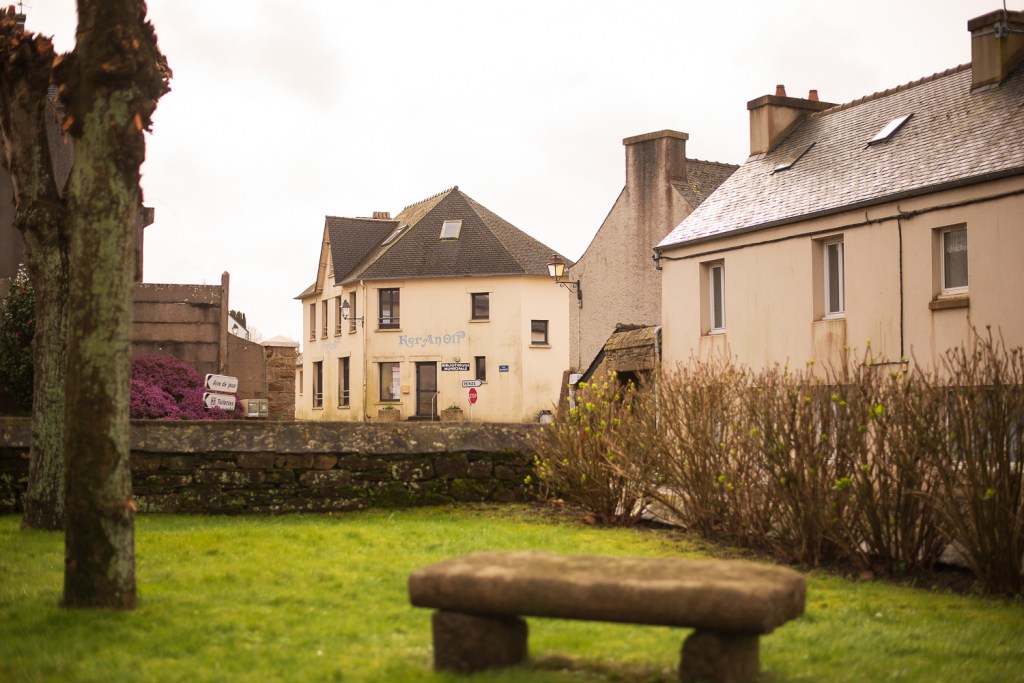
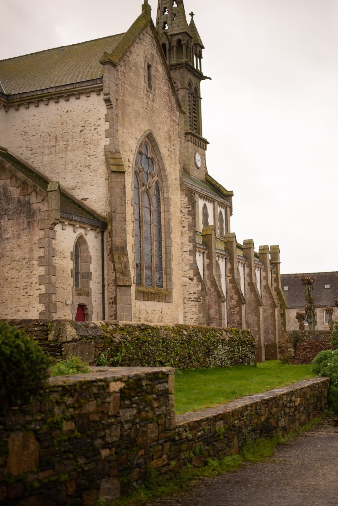
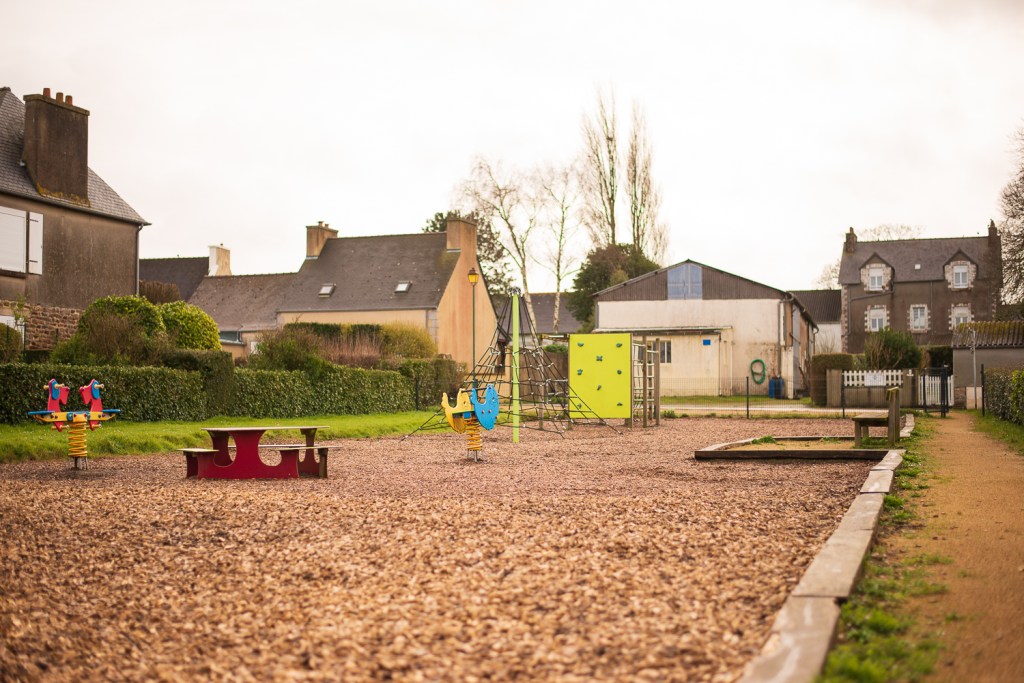
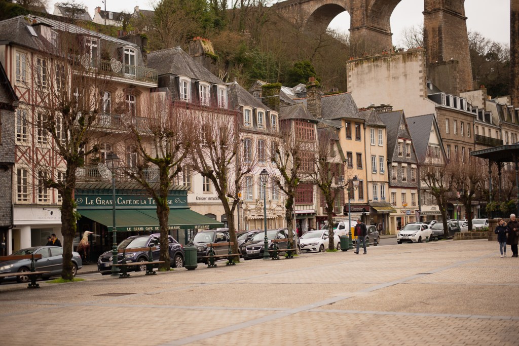
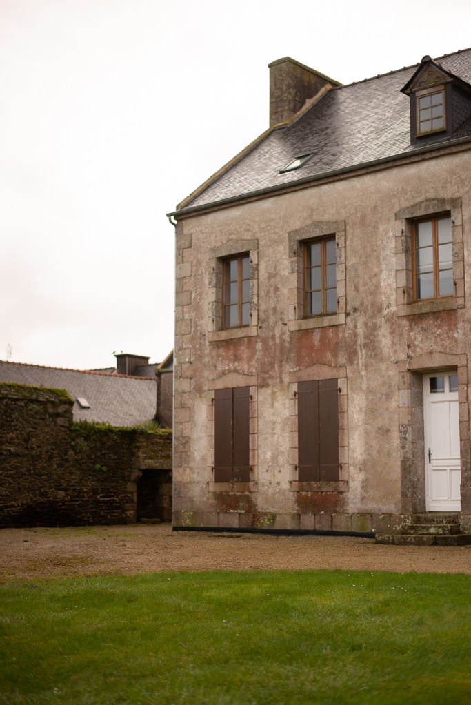
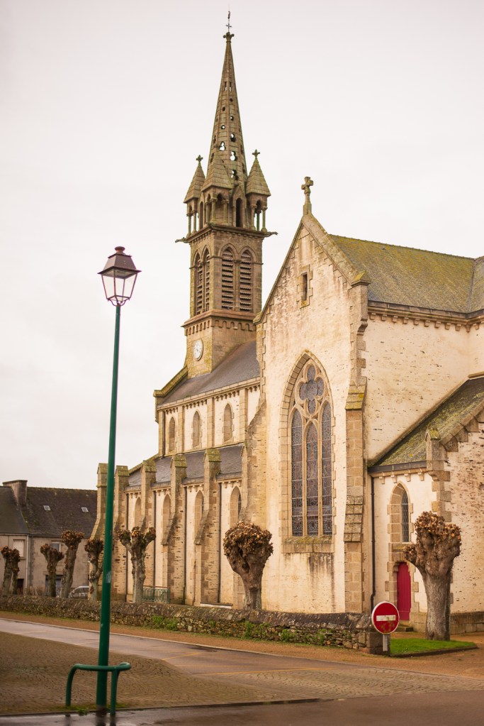
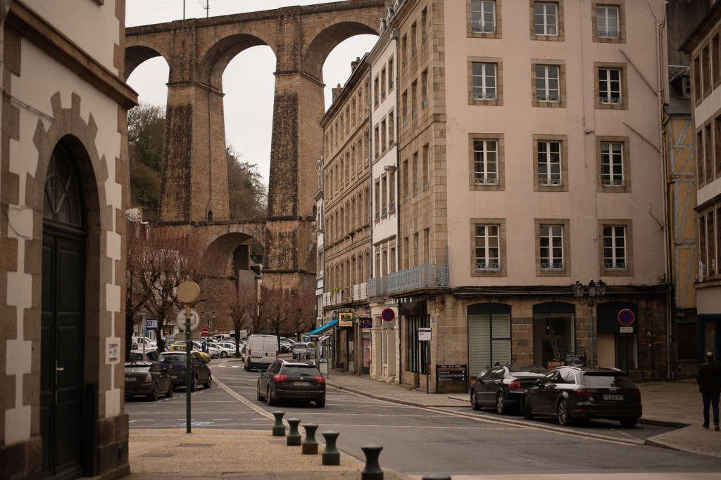
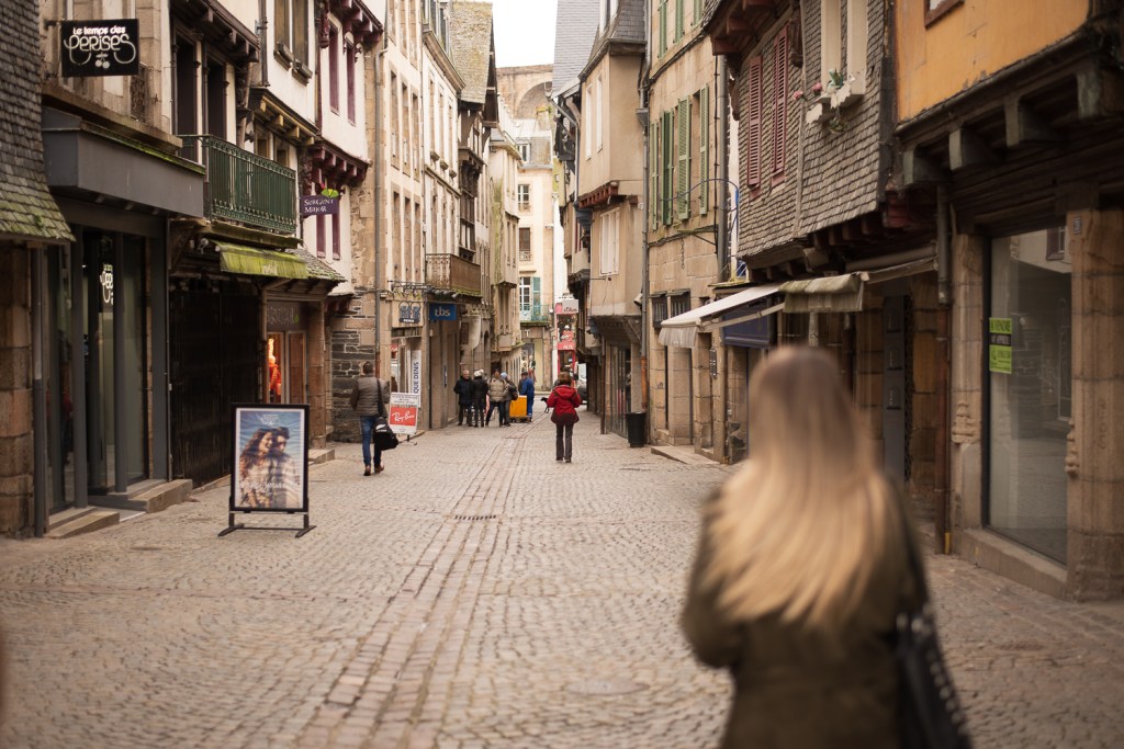
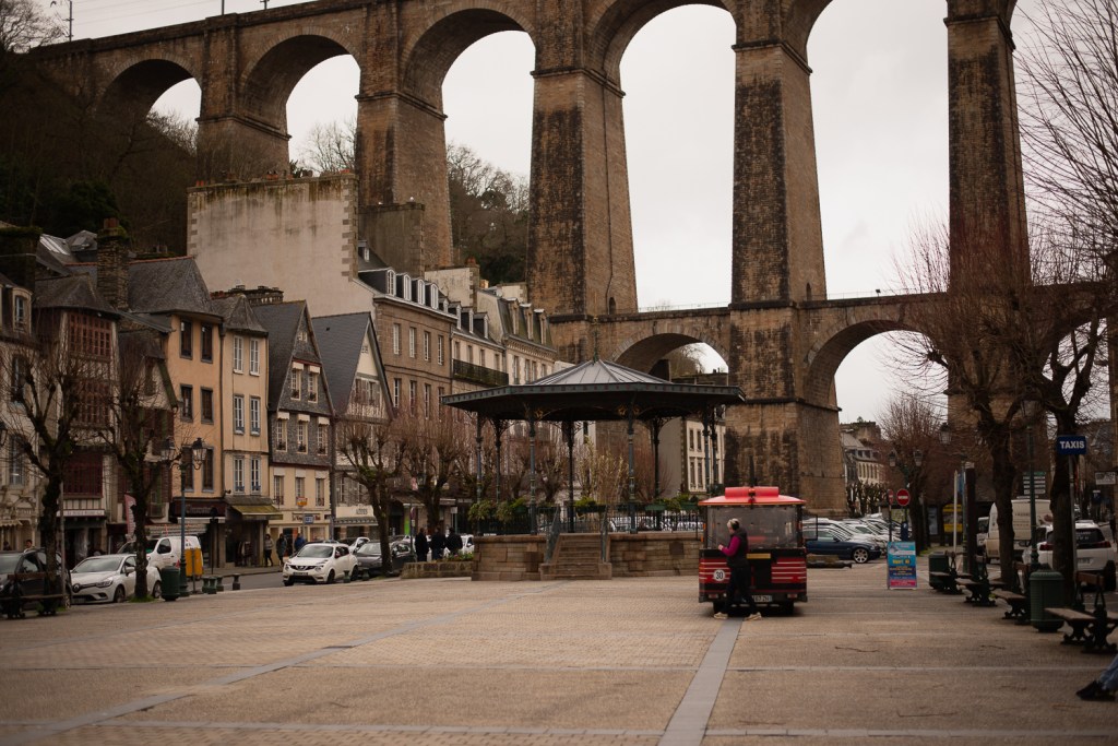
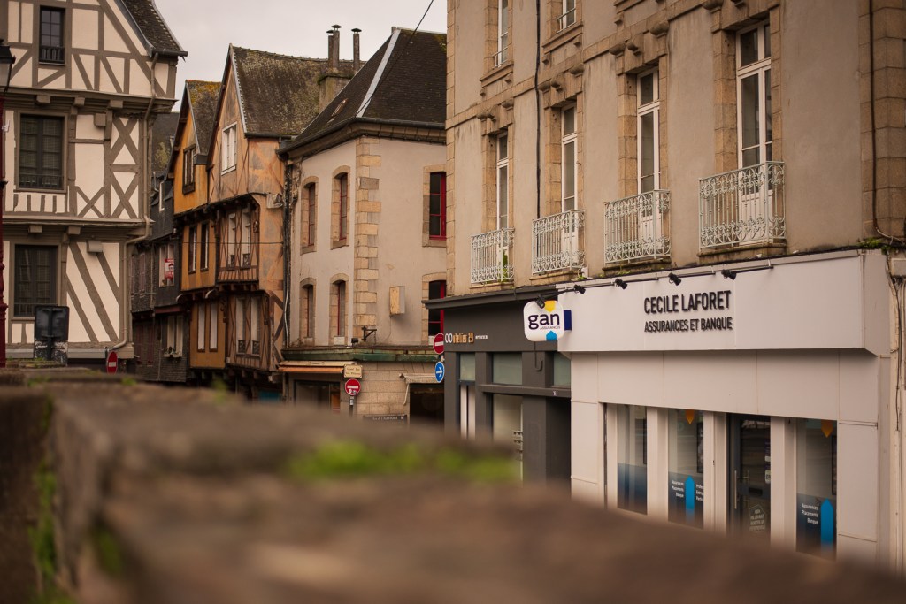
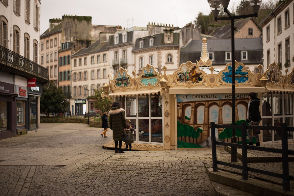
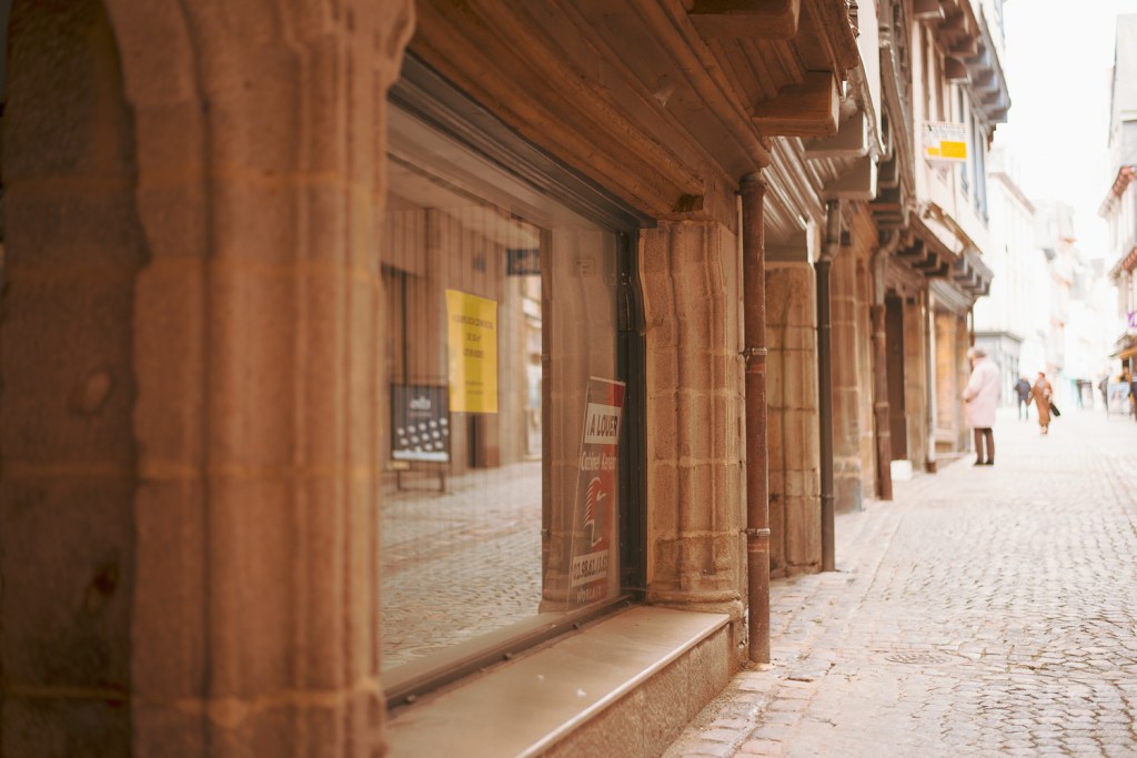
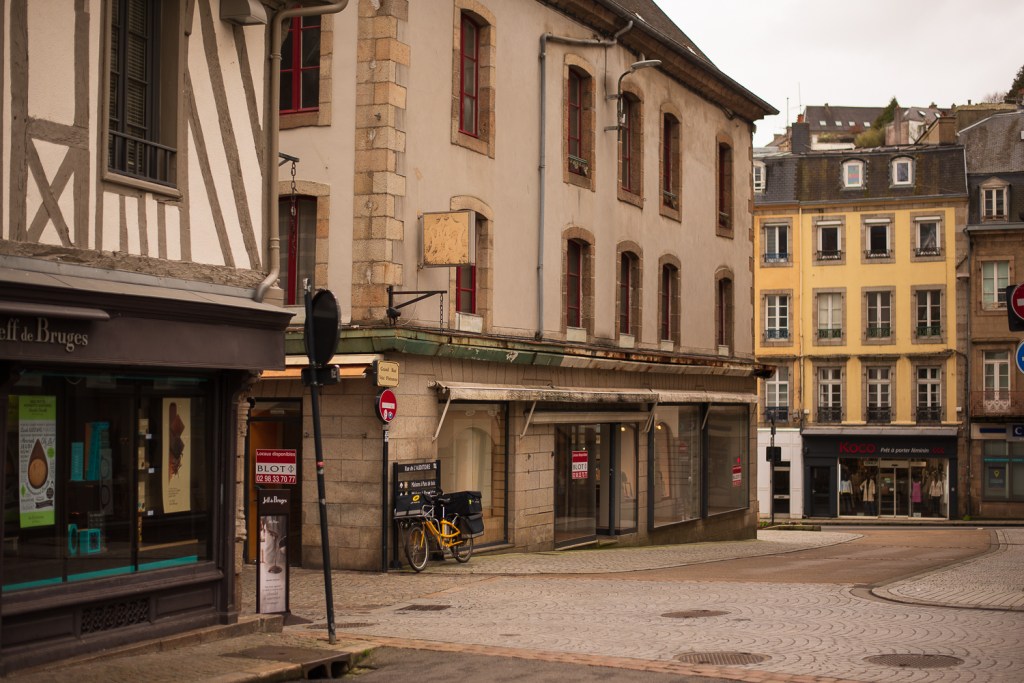
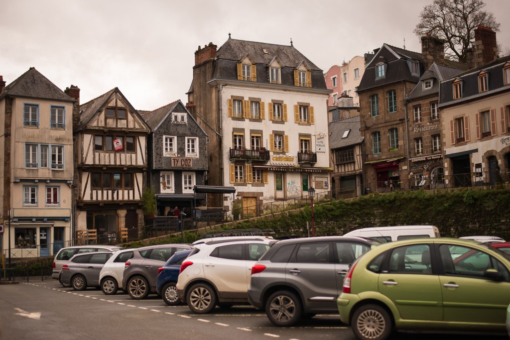
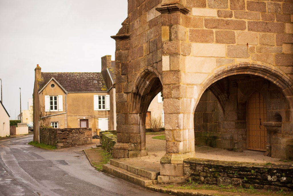
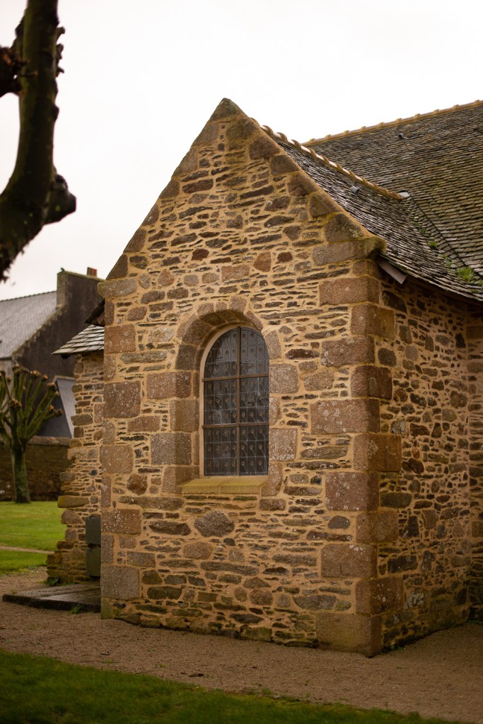
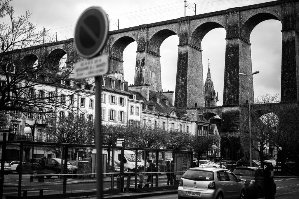
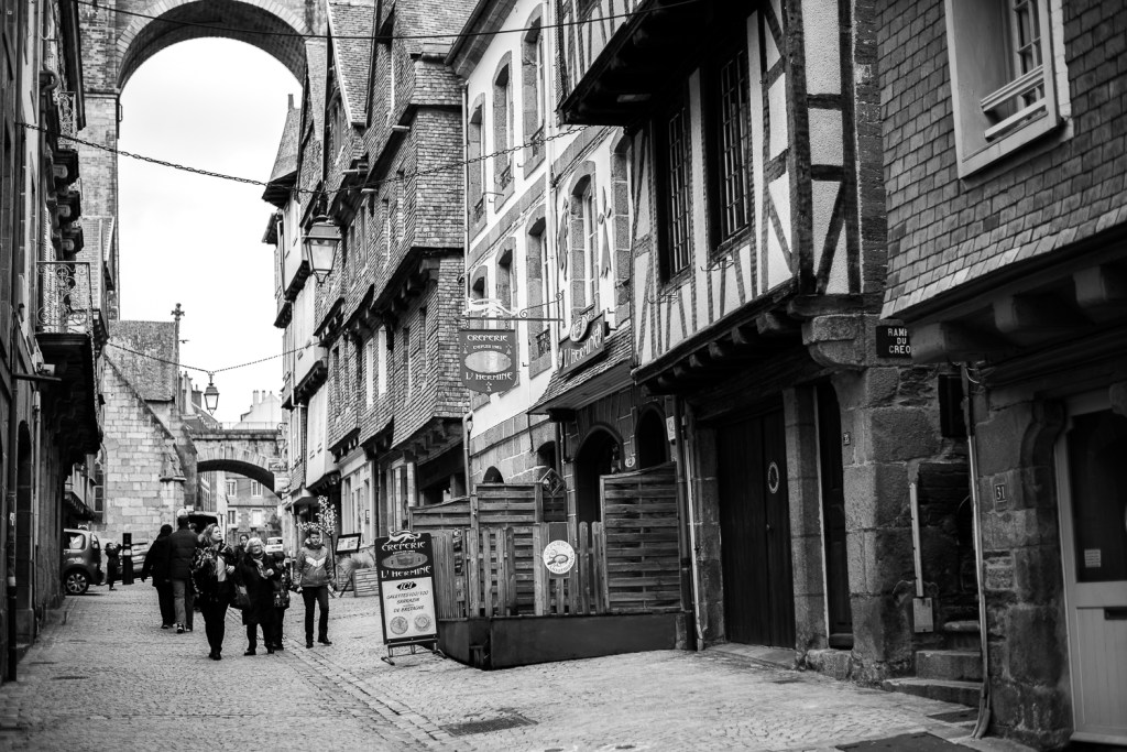
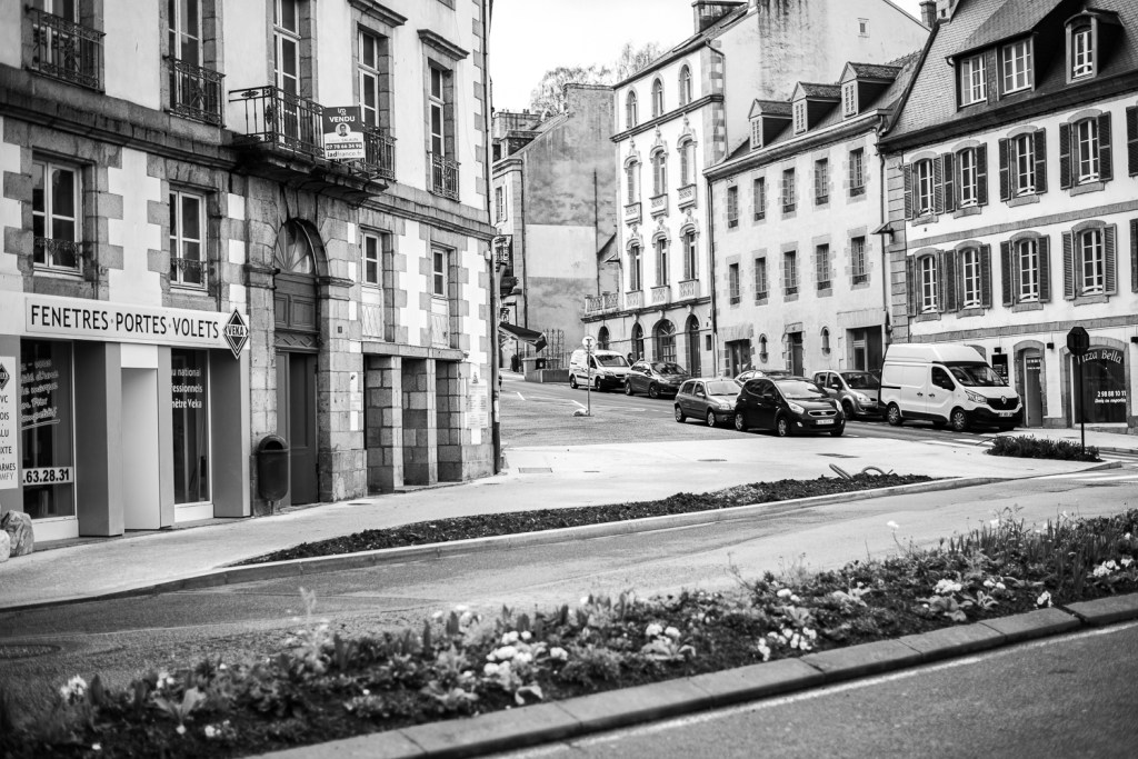
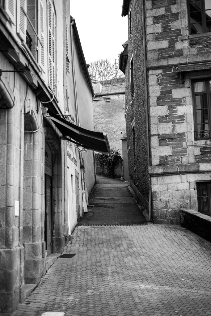
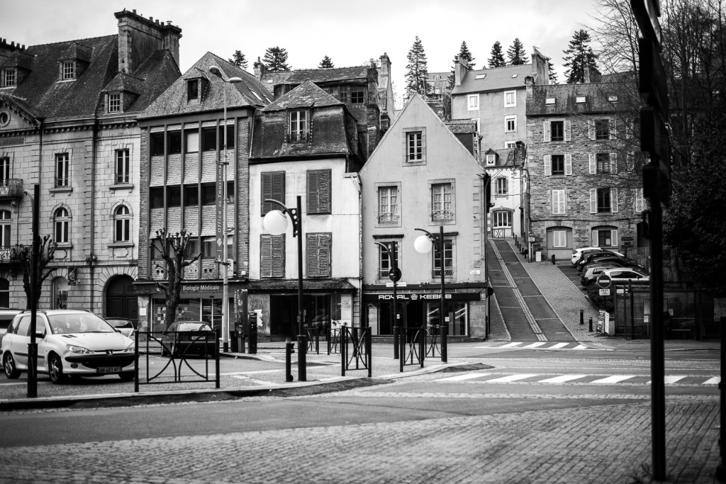
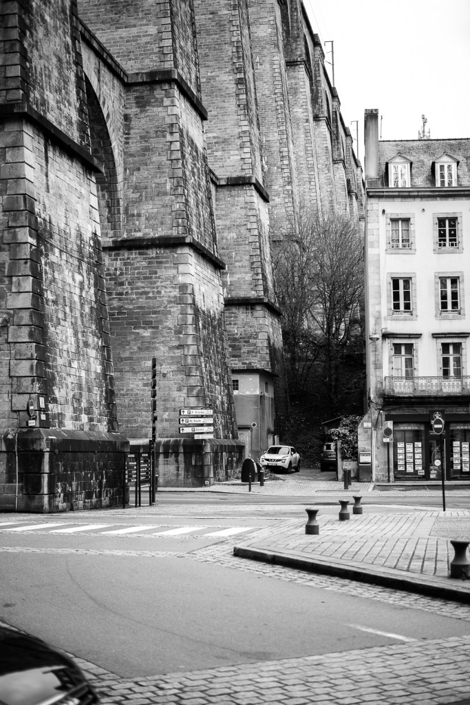
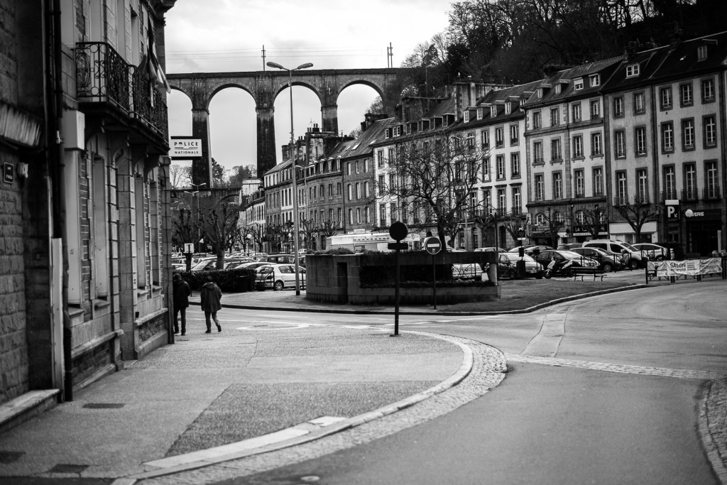
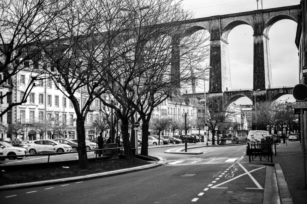
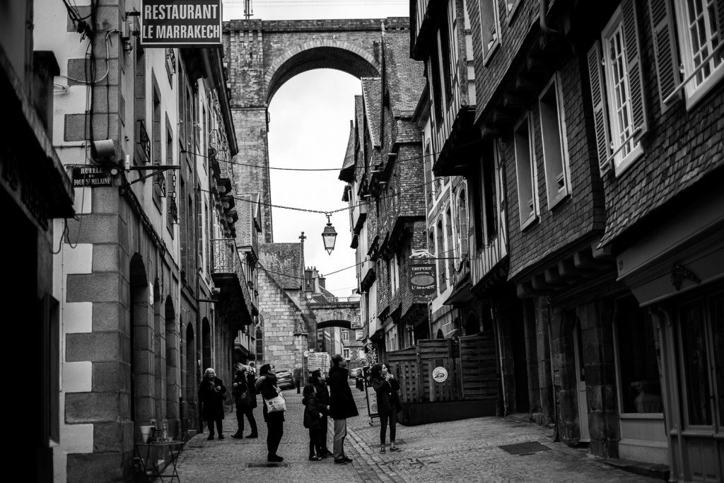
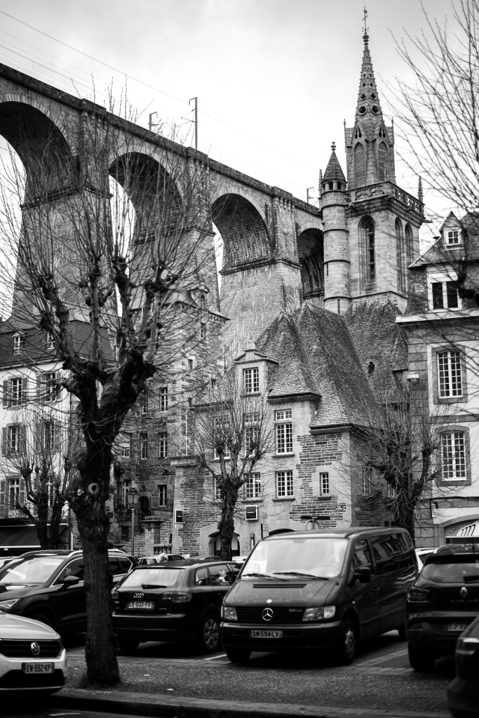
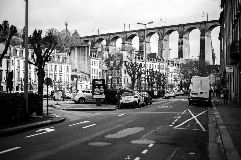
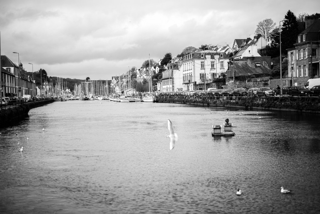
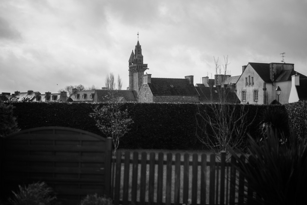
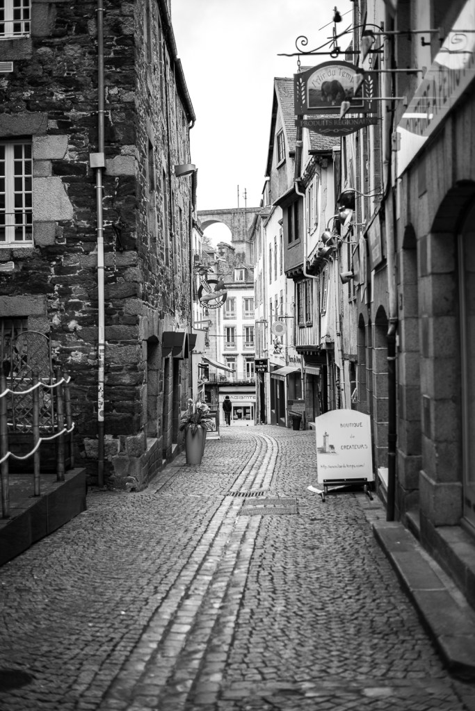
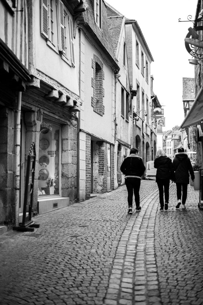
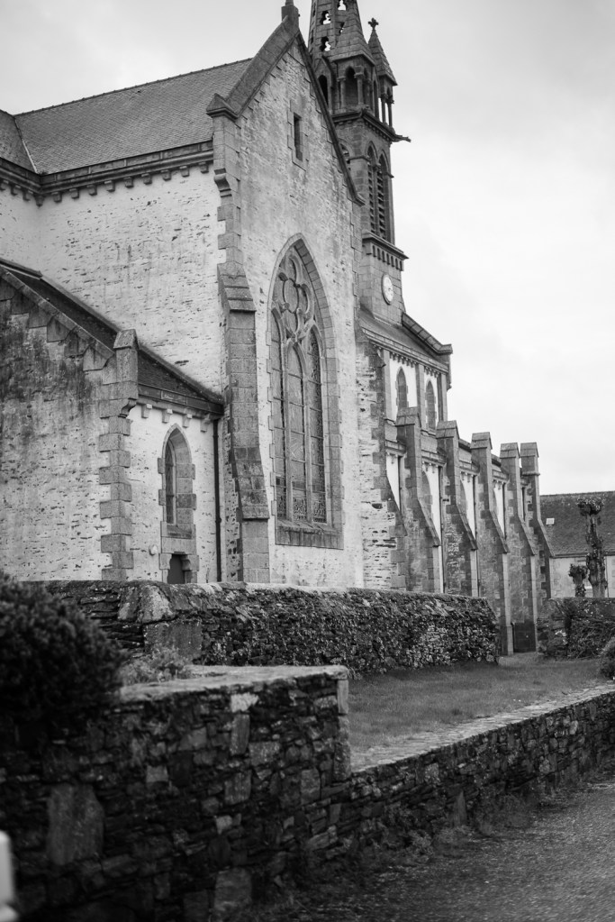
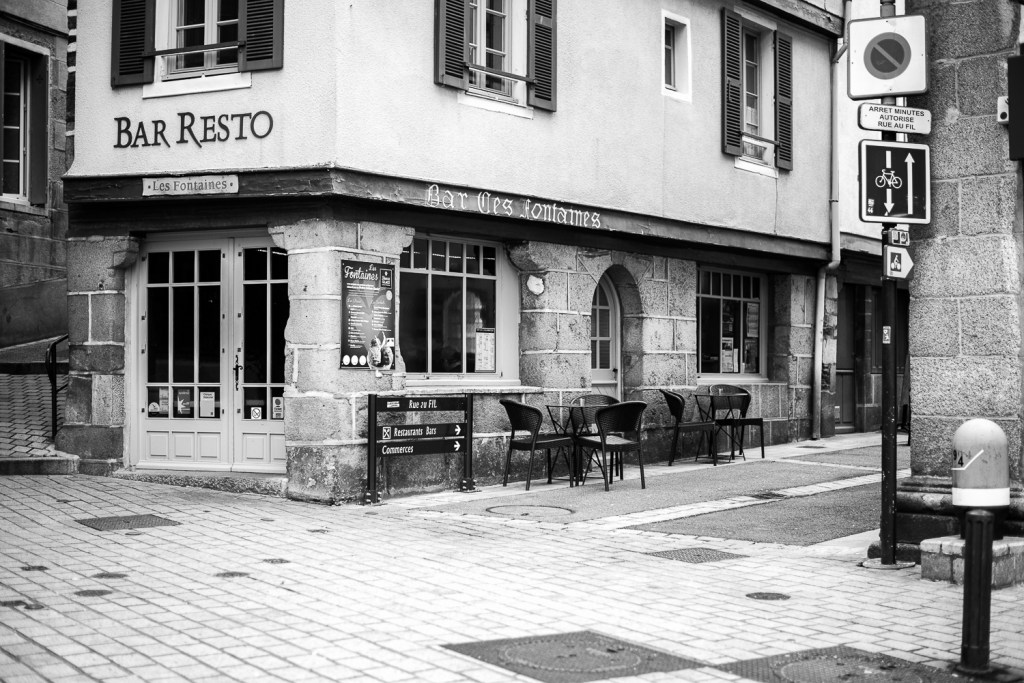
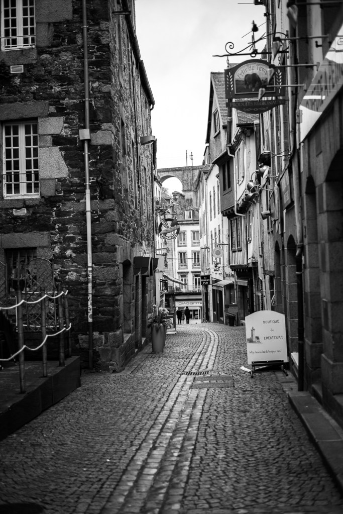
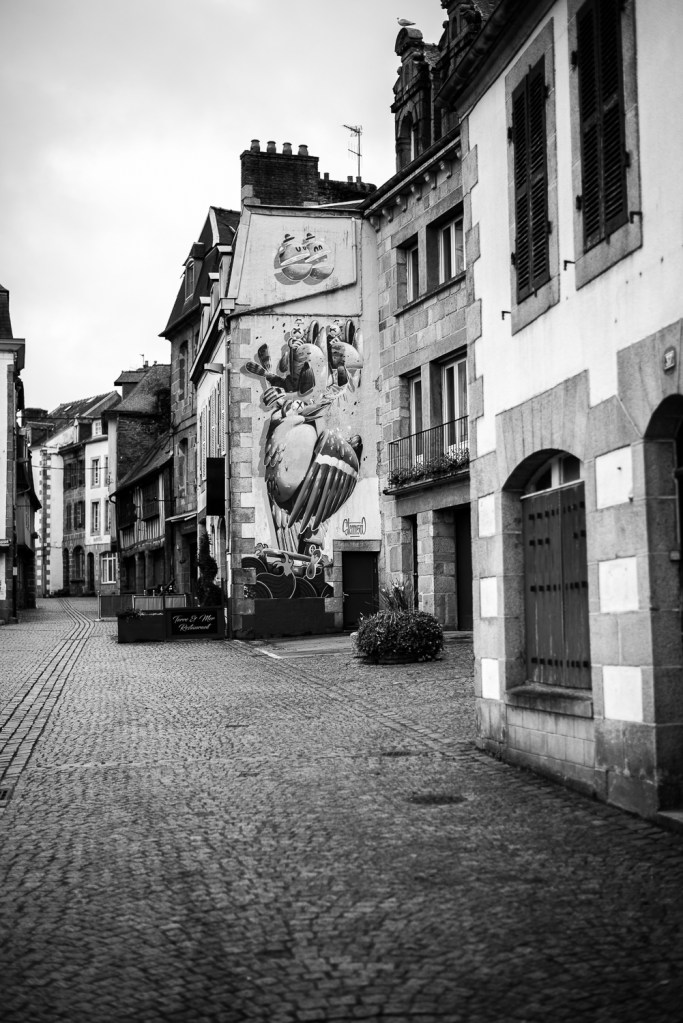
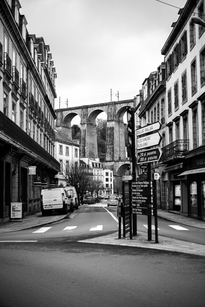
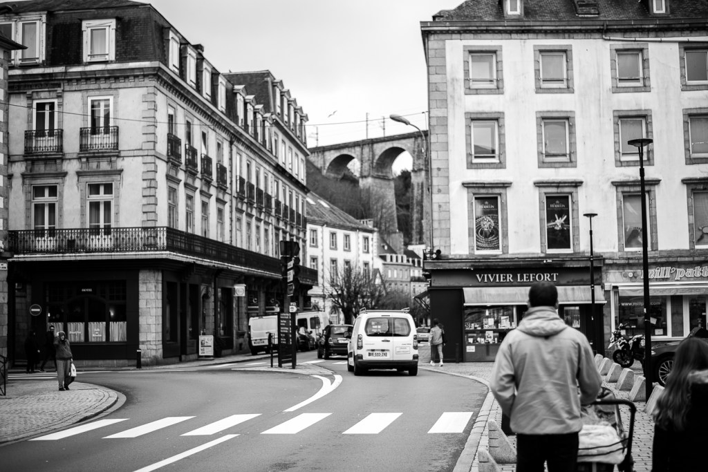
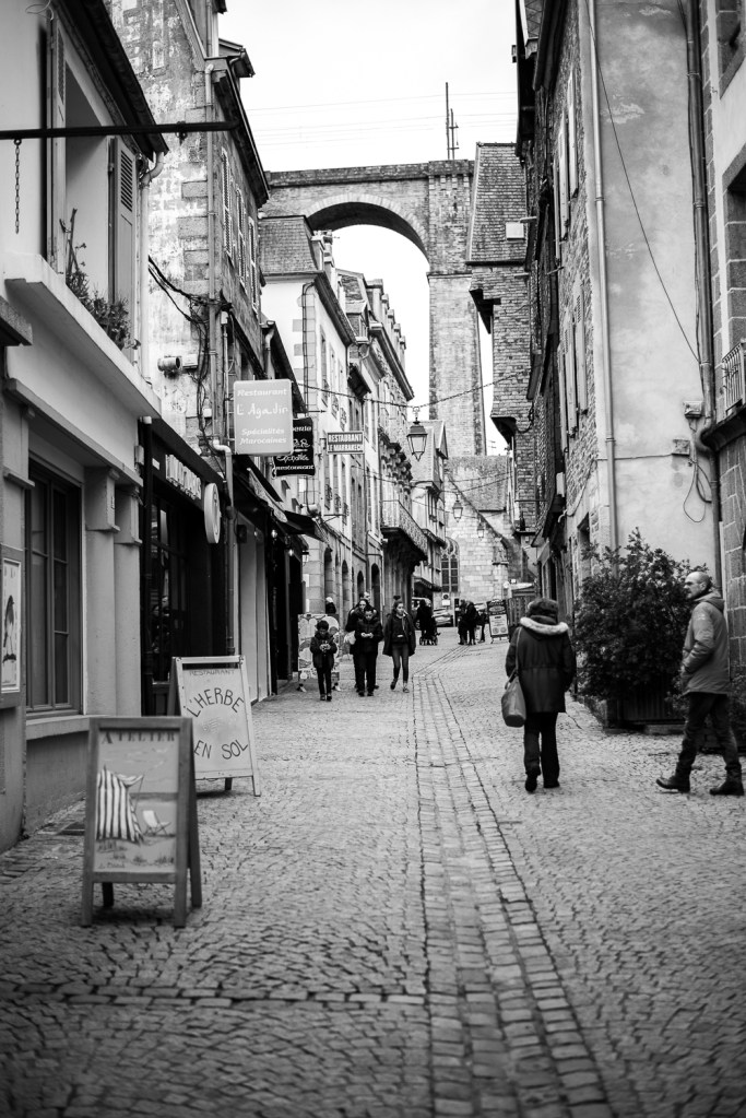
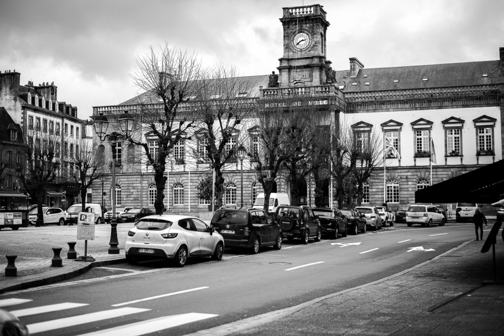
I took these images whilst on a brief visit to Morlaix, France in March to visit family. I had this exercise in mind and was keen to experiment with some street photography style images. I used my 50mm 1.8 lens paired with my D800. I wanted to work with a prime lens taking inspiration from previous research and the advantage of a wide aperture for depth of field and working in poor light. It is also a great challenge to work in the confines of a single focal length and makes composition and framing more demanding.
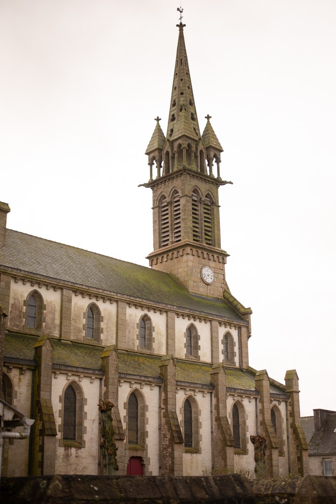
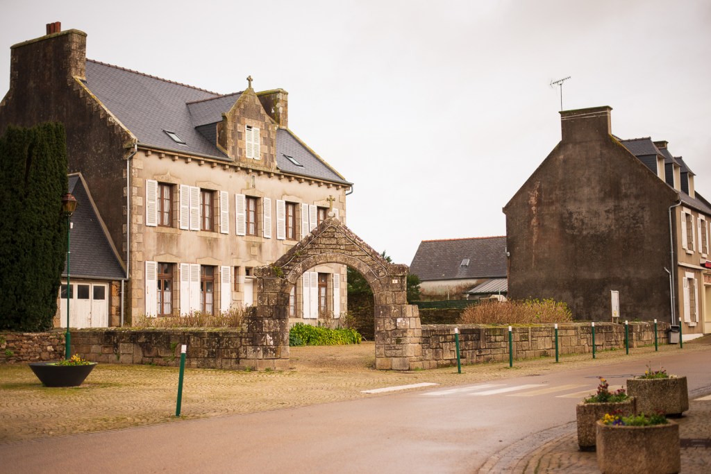
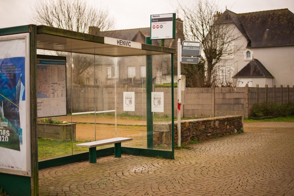
Colour images
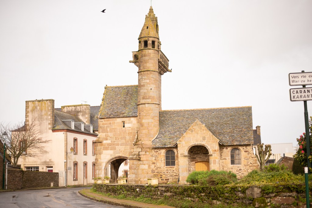
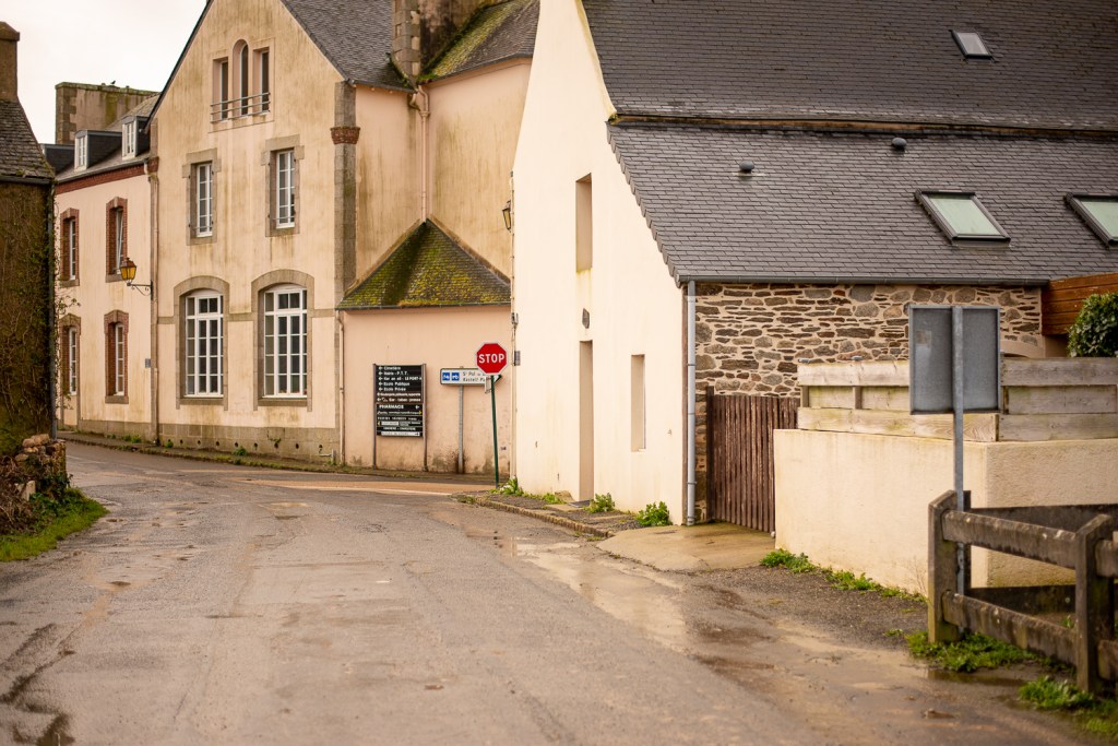
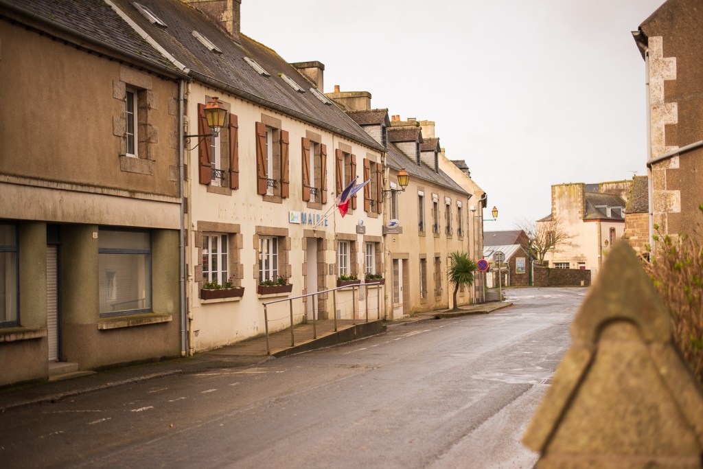
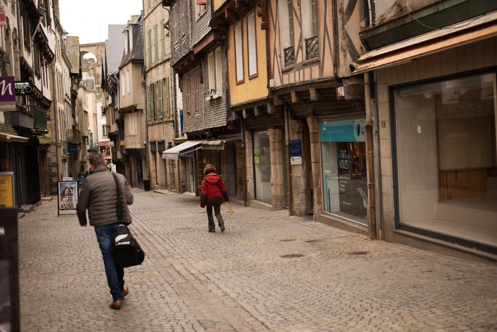
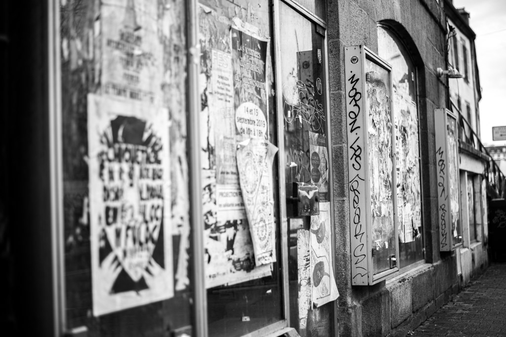
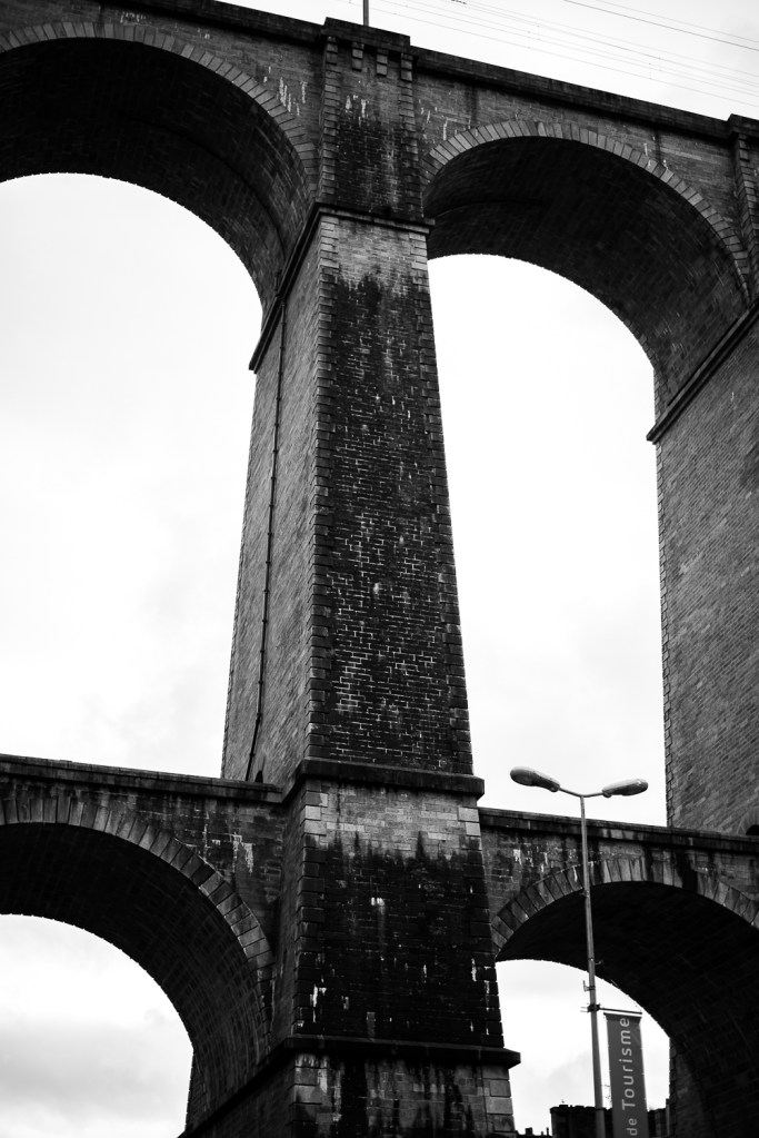
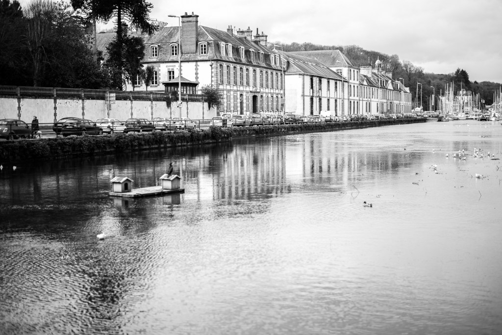
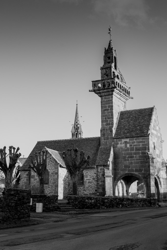
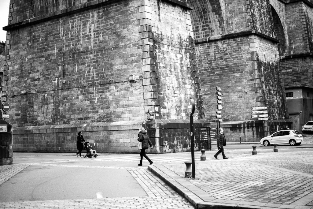
Black and white images
Reflection
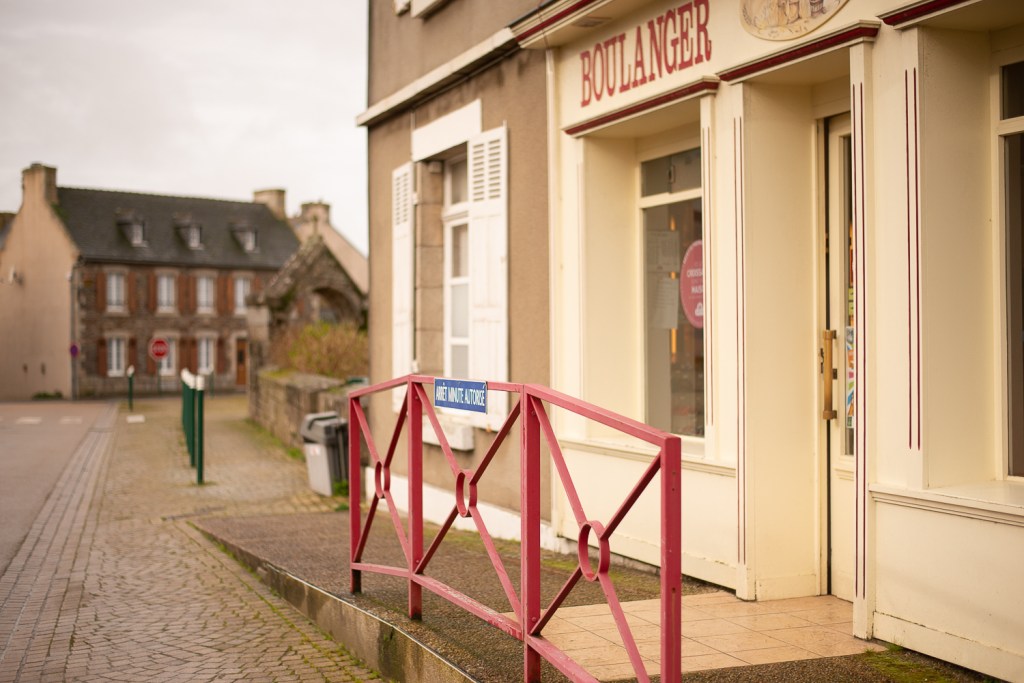
On reflection of the images I took, I personally prefer the monochrome edits. I have made very minimal edits to the images, less than basic, and feel that adding colour to these images changes the mood entirely. I really like the splashes of colour that appear in some of the images, but personally believe that the worn and aged buildings are better reflect with the contrast of black and white. I think monochrome also creates a certain mood, but symbolises depth, character, detail and atmosphere entirely differently to colour. I think there is a place for colour in landscape/street photography but only where colour is of paramount importance within the frame. To my mind colour is enhanced and of more importance when photographing flowers, sprawling coastlines, longer exposures (this also works for black and white) just about anything that requires the colours to be dominant in the frame, creating the mood that fits the image. I enjoy food photography and hope to specialise in this field and for advertising purposes or anything for that matter the colour output of the image add to the texture, detail and authenticity of the food. A lot of food photography currently uses natural light which also adds to the realistic feel of the food being photographed. Colour suggests light and has a more happy, vibrant feel. Whereas monochrome suits the portrayal of busy streets, everyday life, aged buildings and lumbering structures. This is by no means a sweeping generalisation, ultimately it depends on what you are shooting and the mood in which you want to portray it. It can also be decided purely by the needs of the shoot in terms of what its ultimate context will be. I have added a couple of my images below which highlight this idea.
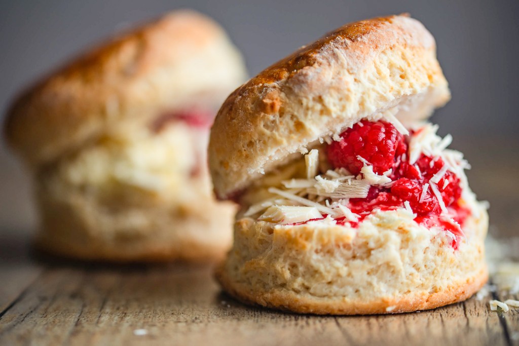
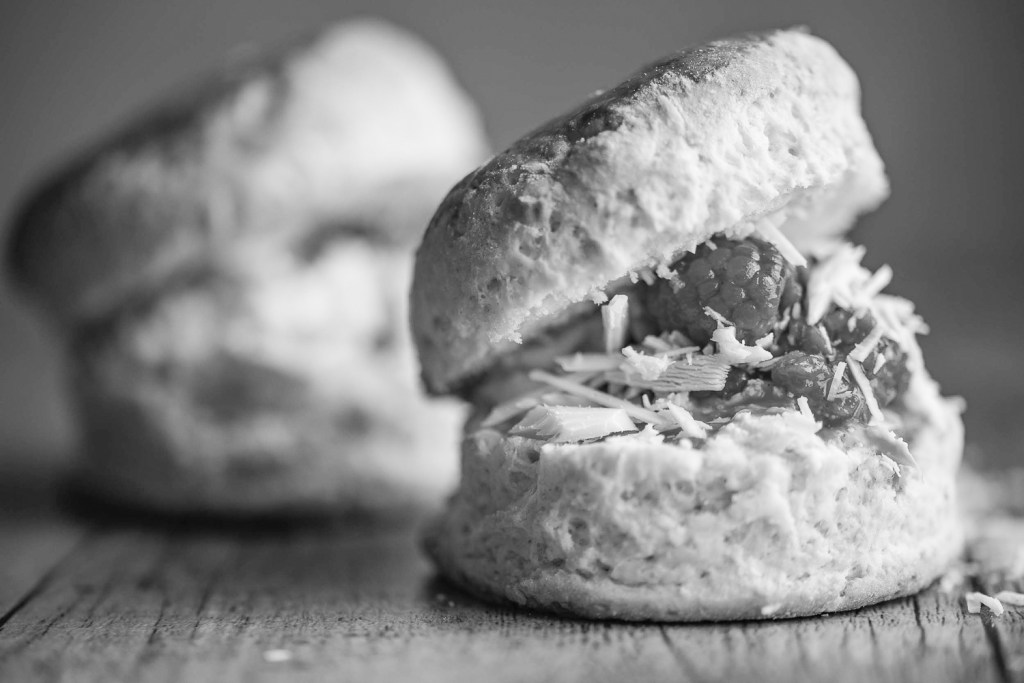
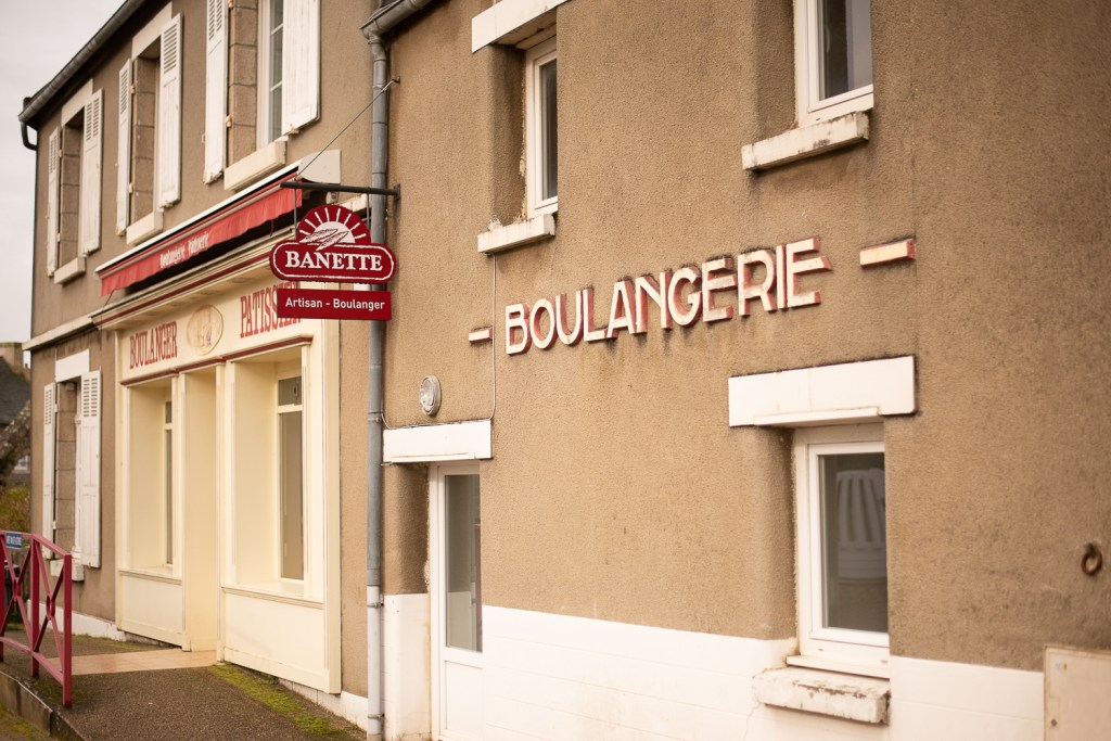
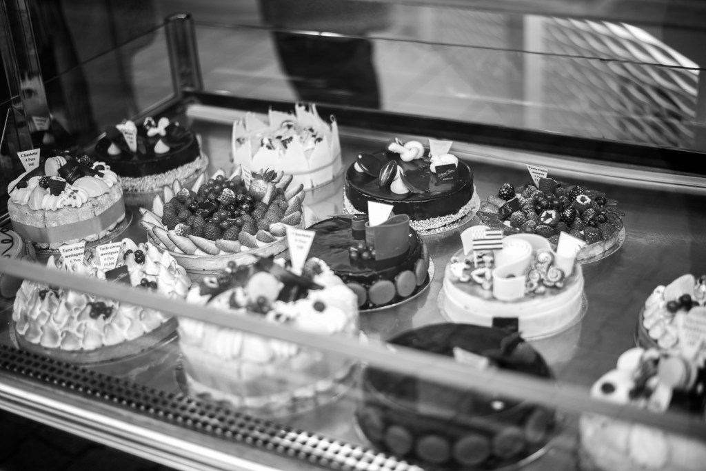
To my mind this image does not work in monochrome emphasising the idea that colour is important when that is the discerning characteristic of the image. It certainly wouldn’t suit a client wishing to market they local bakery.
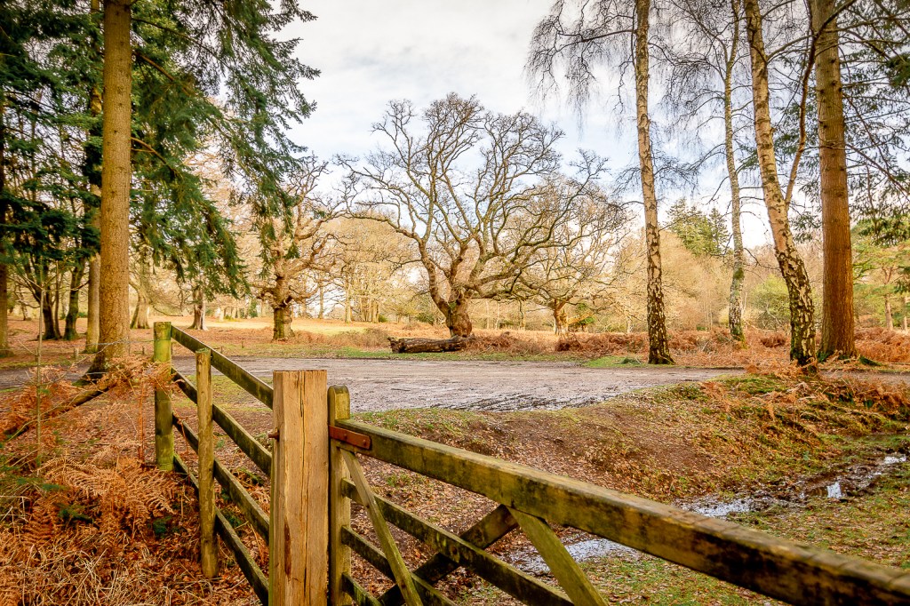
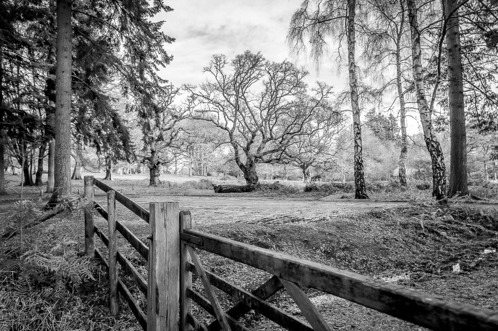
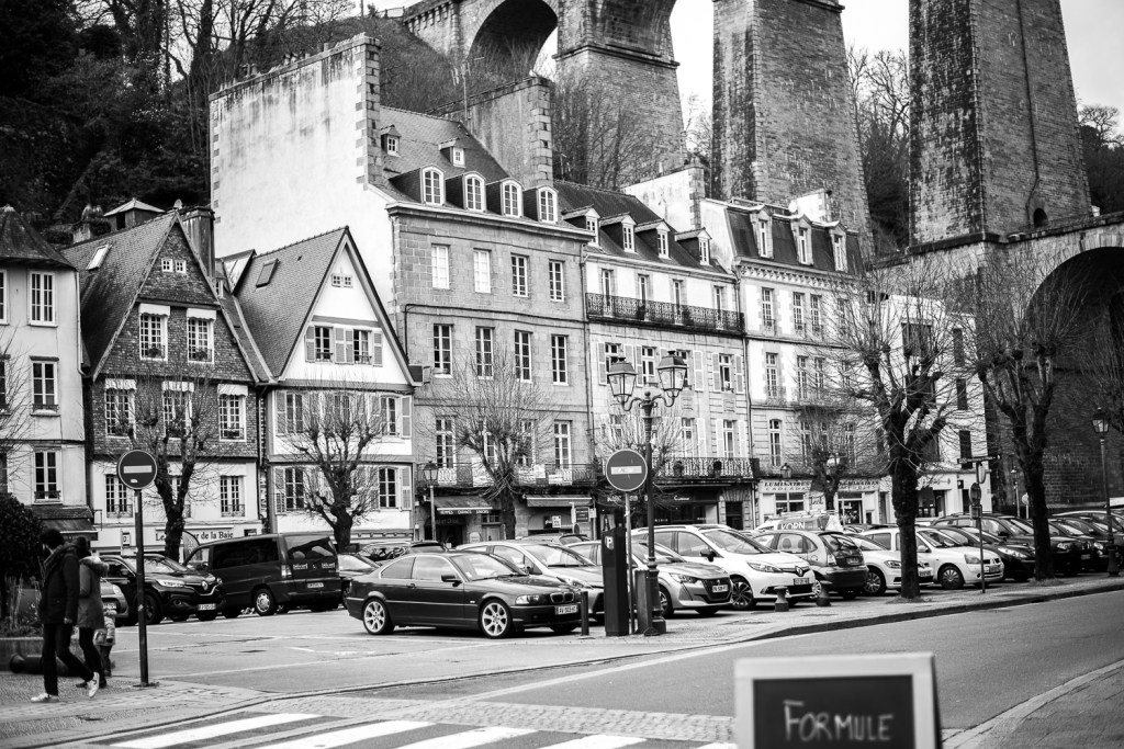
Whilst these images above work equally well in both colour and black and white, perhaps only personal opinion would be the deciding factor here in which to portray the scene to the viewer. These two images also reiterate the contrast in mood, feeling and raw emotion evoked in images in both colour and monochrome. Its difficult to say monochrome is better for street photography or colour is better utilised in landscape imagery for example, but what is important is for the photographer to understand the power of both and have the ability to harness this in his or her repetiore.
